ABOUT THE BRAND – Atomic is a Canadian psilocybin microdosing company that specializes in merging psychedelics and wellness, making it approachable for both the curious and the experienced. Rooted in education and science, Atomic’s approach to its products will help individuals enhance their wellness regime through the practice of taking low, non-hallucinogenic doses of psychedelics with the goal of receiving health benefits and other advantages such as mood enhancement or improved concentration.
Created with Millennials and Gen Zs in mind, Atomic aims to bridge the generational gap through wellness, health, and psychedelics.
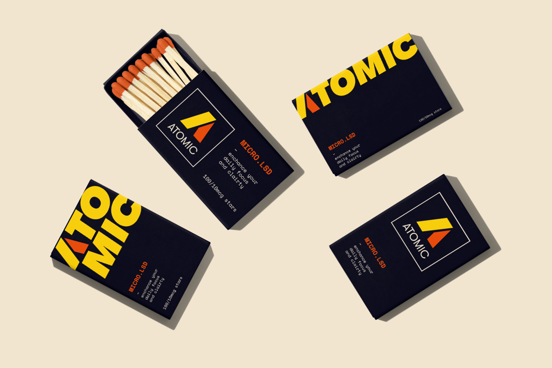
CHALLENGE – Atomic, a Canadian psilocybin microdosing company, needed a complete visual brand identity overhaul that reflected their commitment to science and education while making the concept of microdosing approachable to both novice and experienced users.
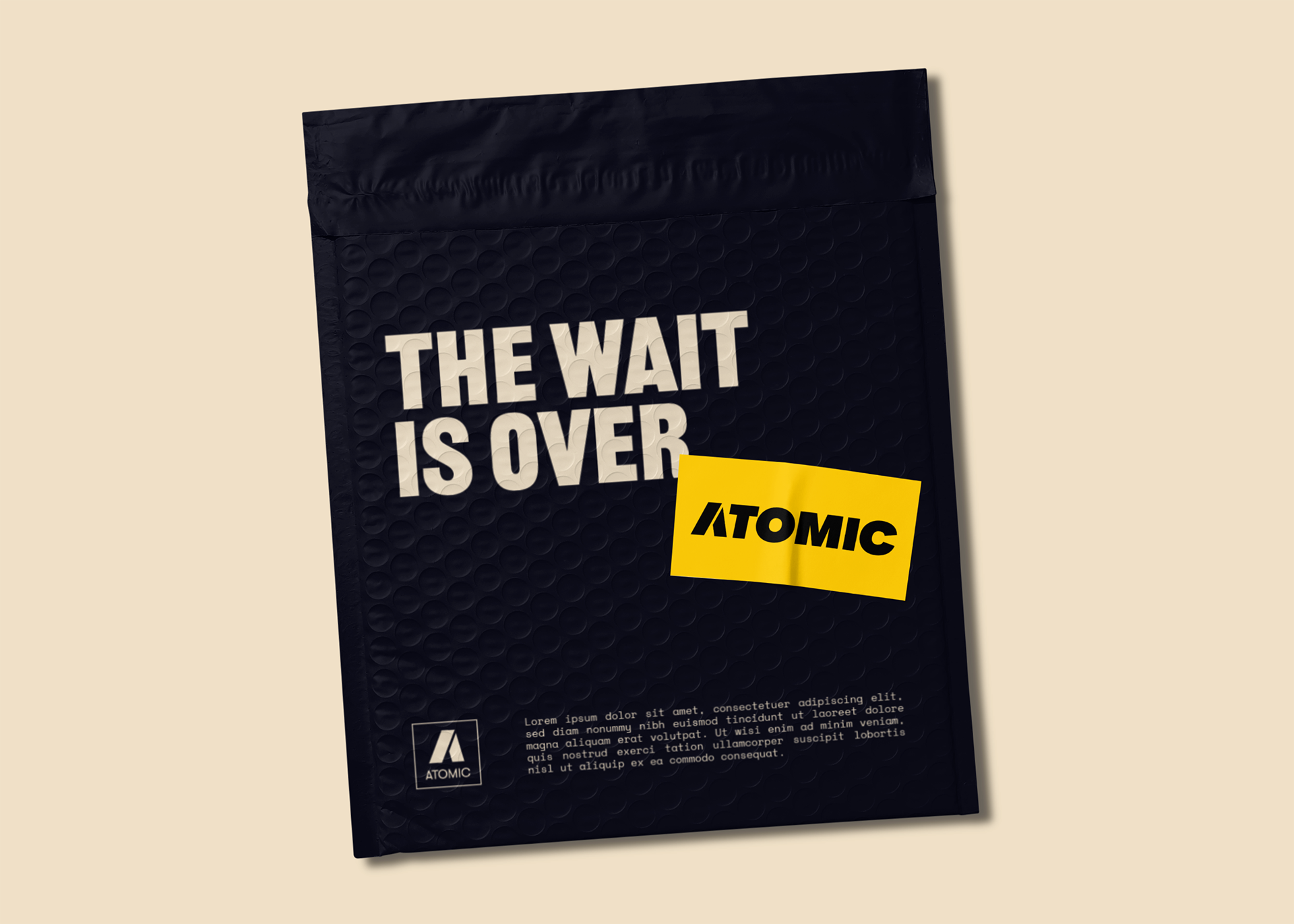
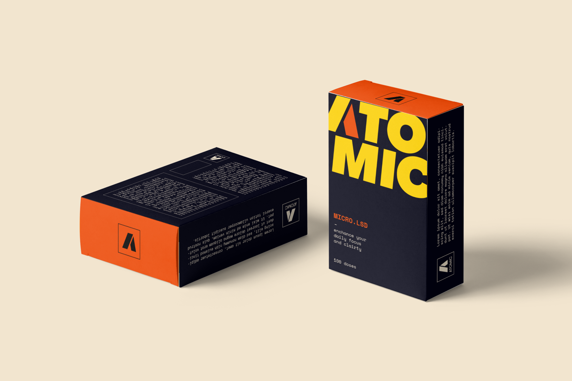
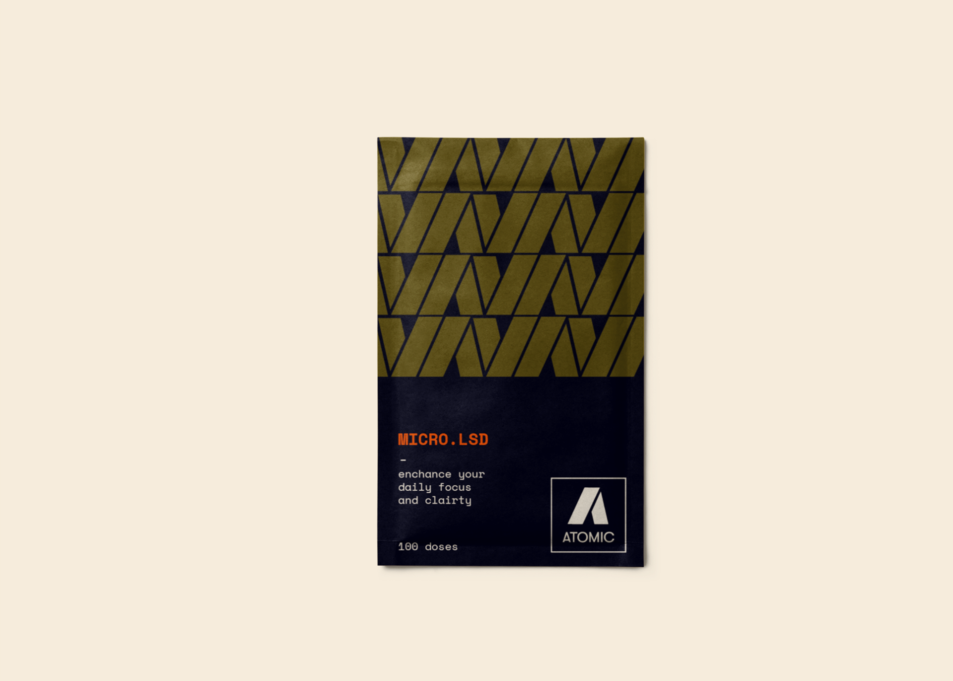
SOLUTION – As Creative Director, I developed and executed the visual brand identity, including logos, typography, colour palette, packaging design mockups, and web design mockups. I also assisted in the development and design of the website, ensuring it aligned with the overall brand strategy. In addition, I coordinated and hired a copywriter to create copy that reflected the brand's tone of voice and messaging.
RESULTS – With the help of my team, Atomic's new visual brand identity and website are now live, providing a sophisticated and approachable image for the company. The new brand has resonated with both novice and experienced users, helping the company reach a wider audience and promote the benefits of microdosing in a responsible manner.